Toning a black & white print is a dark art (and one that I’m just beginning to learn). So many different toners exist and can be used to create different coloured tints according to the concentration, temperature, time taken and combination of multiple toners that it is hard to know where to start. To make matters worse, many of the best darkroom textbooks that I usually refer to mention toners that have long since been discontinued. As part of my quest to learn about toning techniques, including split toning, I decided to acquire several modern(-ish) toners and experiment with them.
- Ilford Harman Selenium toner
- Agfa Viradon New brown toner (now discontinued)
- Fotospeed ST20 Variable Sepia toner
- Fotospeed BT20 Blue toner
- Fotospeed RT20 Copper/Red toner
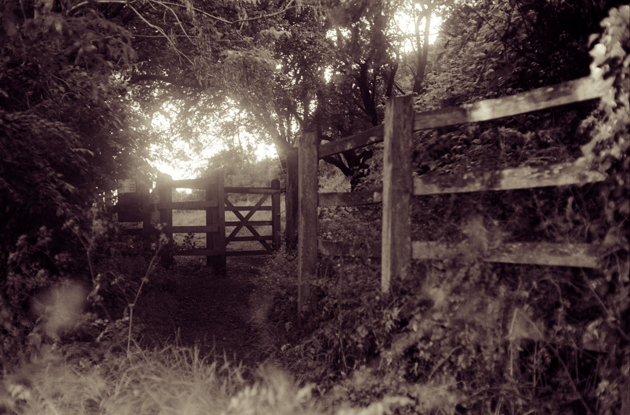
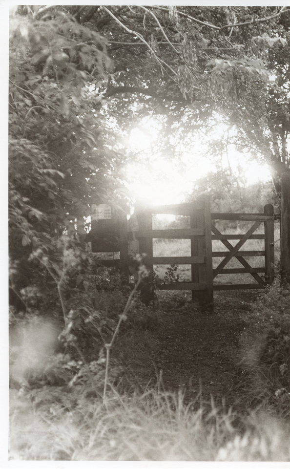
But first, I need a set of near-identical prints to work with. I decided to use this recent picture of a gate I took on Troopers Hill. This version of the image was scanned directly from the negative, and has been given a fake digital selenium tone.

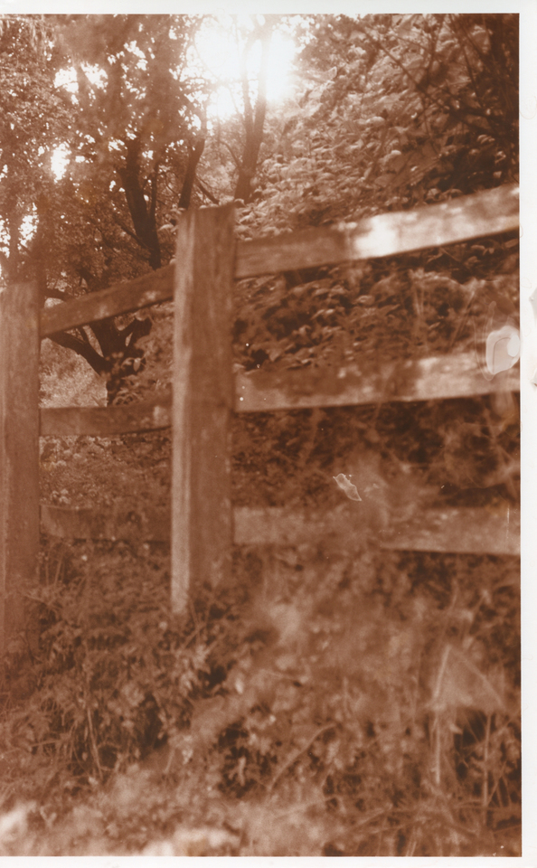
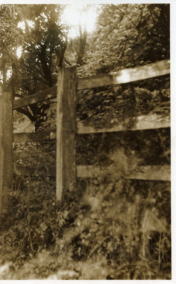
The original negative was shot on 35mm Ilford FP4+ using a Canon Pellix QL and Canon FL 50mm f/1.4 lens. This was actually the first time I used the Pellix and the light meter wasn’t working, so I guessed. The exposure is a bit “off” but the negative shows a wide range of shades so it is suitable for this experiment. The test prints were made on Kentmere VC Select Glossy using a Schneider-Kreuznach Componon-S 50mm f/2.8 lens and my newly-converted LED enlarger. Because of the number of tests I wanted to do, I made seven prints to finish a pack of old paper and decided to cut them all in half to give fourteen tests. These scans of the prints have not been digitally altered, although you can only infer so much from them because they don’t truly reflect the prints.
After making the prints I noticed that some of them have fixer stains. This is nothing to do with the toning process, and serves as a lesson to me to pay more attention to which tongs have been in the fixer!
These pictures are most certainly not a masterclass in toning and are simply the results of my initial experimentation. There is enormous room for improvement with the timings and concentrations of the toners, and in some cases I probably need to adjust the exposure of the initial print.
| # | Toners | Times | Notes |
|---|---|---|---|
| 1 | Untoned | Green cast | |
| 2 | Selenium | 3 min | Blackens shadows, increase contrast. |
| 3 | Viradon | 10 min | Scan doesn’t really reflect the colour. More purple-brown in reality. |
| 4 | Sepia | Bleach 2 min + 5 min | Nice vintage effect but probably too pronounced for most purposes. Should probably be bleached less. |
| 5 | Blue | 30 sec | Very fast toner that darkens the print. |
| 6 | Copper/Red | 8 min | Leaves a strange scum on the surface of the print which needs removing with a cloth. |
| 7 | Viradon then Selenium | 5 min + 9 min | More purple than Viradon on its own |
| 8 | Selenium then Viradon | 30 sec + 10 min | Too long in selenium means the Viradon was prevented from working |
| 9 | Sepia then Blue | Bleach 2 min + 1 min + 20 sec | Has lost some density. Should probably have been bleached for a shorter time (see #14) |
| 10 | Copper/Red then Blue | 3 min + 20 sec | Split OK but the divide is too obvious. Should probably let the copper work longer to tone the midtones more before unleashing the blue. |
| 11 | Sepia then Selenium | Bleach 2 min + 30 sec + 6 min | Almost completely bleached and toned in sepia almost to completion. Selenium doesn’t show. |
| 12 | Selenium then Sepia | 1 min + Bleach 2 min + 6 min | Barely distinguishable from plain selenium (#2). See #8. |
| 13 | Blue then Selenium | 10 sec + 2 min | Split-toned well but needs longer in blue. It looks too blue to begin with, but the selenium quickly counteracts the blue. |
| 14 | Sepia then Selenium | Bleach 30 sec + 30 sec + 2 min | Similar to #11. Partial bleaching of highlights & midtones which are then restored by sepia, leaving the shadows for the selenium. Split tones well. |


I’m very pleased with these results, and I now have leads for further experimentation. Looking forward to making some nice split-tone prints in the future – both refining the times here to get more subtle effects, and trying new combinations. I reckon Copper/Red followed by Selenium would look nice.

Great test, it’s not easy to see side by sides like this, makes me consider trying the Blue toner. I find even when I use an archival dilution of selenium toner it takes my blacks a touch deeper. Perhaps the slight purple is just what my paper and developer (kentmere with ilford multidev) needs to give a darker Dmax black.
LikeLike